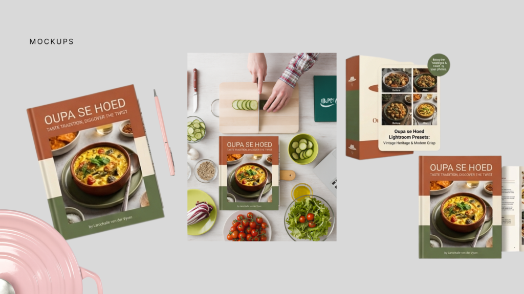
Gesiggie helped Larochelle bring Oupa se Hoed to life as a warm, memorable, and story-driven South African food and lifestyle brand. From shaping the brand’s mission and visual identity to developing the logo, colour palette, typography, mockups, brand photography direction, SEO image descriptions, and portfolio-ready content, Gesiggie created a clear foundation for a platform built around heritage recipes, honest restaurant and Airbnb reviews, travel stories, and local discovery. The Oupa se Hoed identity combines nostalgia with a modern, practical feel, using earthy colours, elegant typography, and a distinctive hat-inspired logo to reflect tradition, personality, and everyday South African storytelling. The result is a brand that feels personal, recognisable, and ready to grow across a website, social media, recipe content, reviews, digital articles, and future cookbook-style projects.